

In this project I was working on the logo redesign and on developing a corporate identity for the Bokobok social network and company.
"Bokobok" in Russian means side by side or hand in hand. It is a new social network and trading platform popular in Eastern Europe launched in 2016 with its own digital currency.
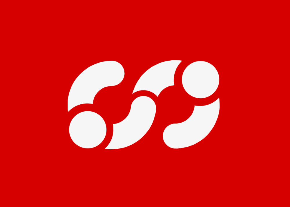
Bokobok sign - infinite handshake
Bokobok logo - side by side
Values and attributes which are important to the company and that the service is associated with.
The logo was developed accordingly. The explanation in English is below the image.
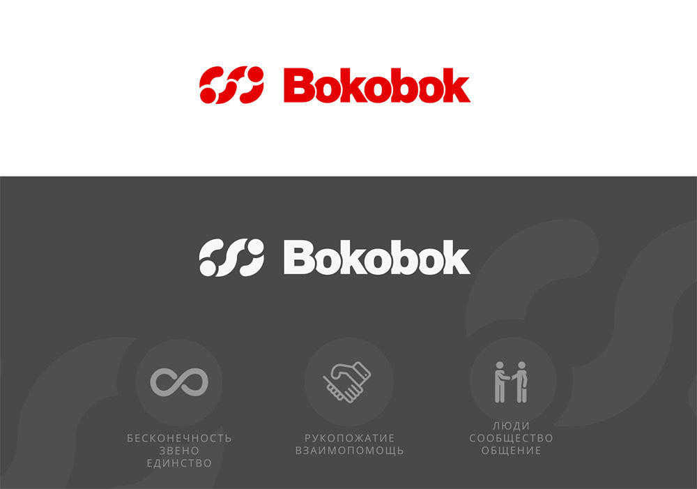
1. Infinity, Unity, Link
2. Handshake, Mutual help, Deal
3. People, Community, Communication
In corporate identity every big internet project are two essential parts - a logo and a brand emblem. Below are presented a few logos of other social projects and their signs.
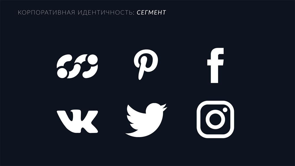
Corporate identity and segmentation analysis
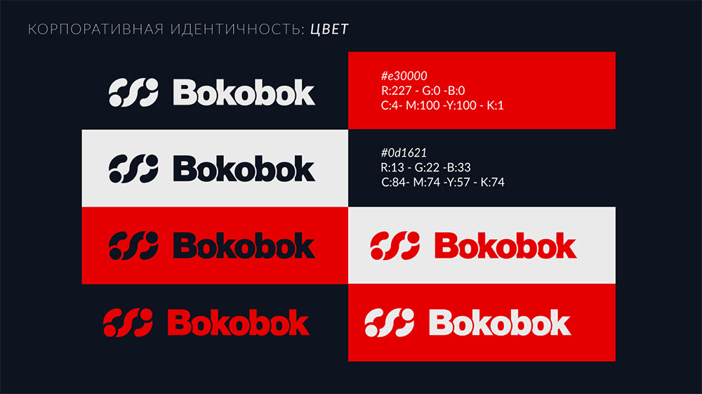
Corporate identity: color scheme
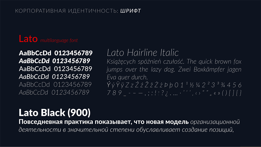
Corporate identity: font
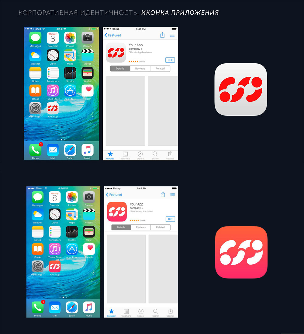
Corporate identity: app and web icon
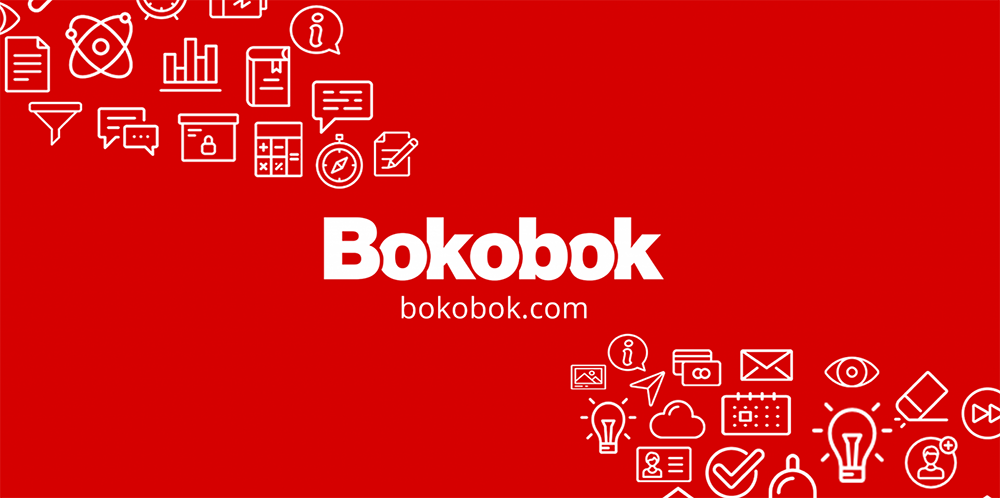
Additionally some landing page templates with new logo were created shown below.
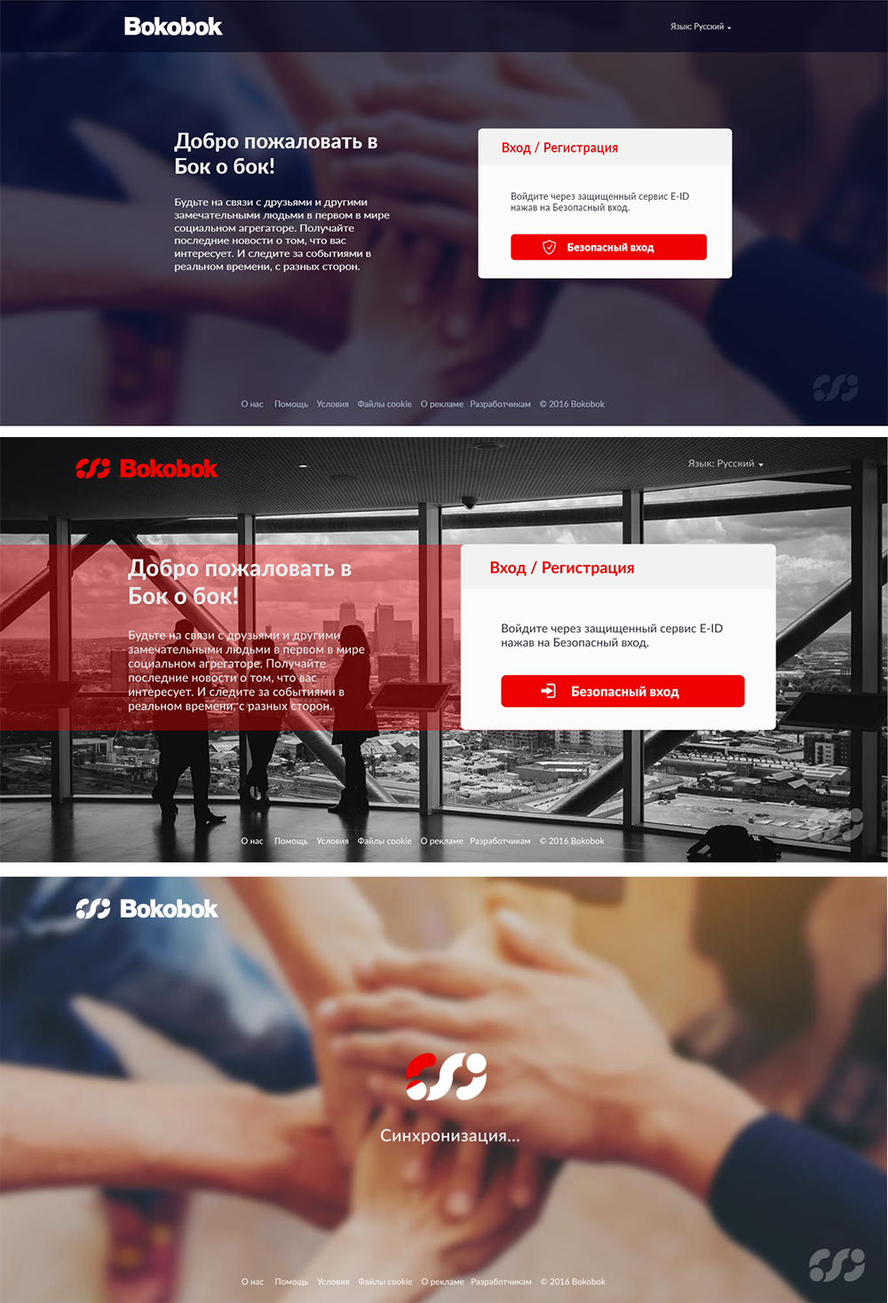
Landing pages templates.