ECurrency
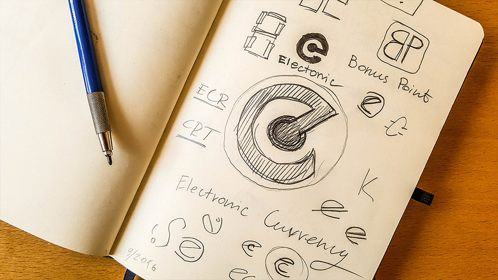
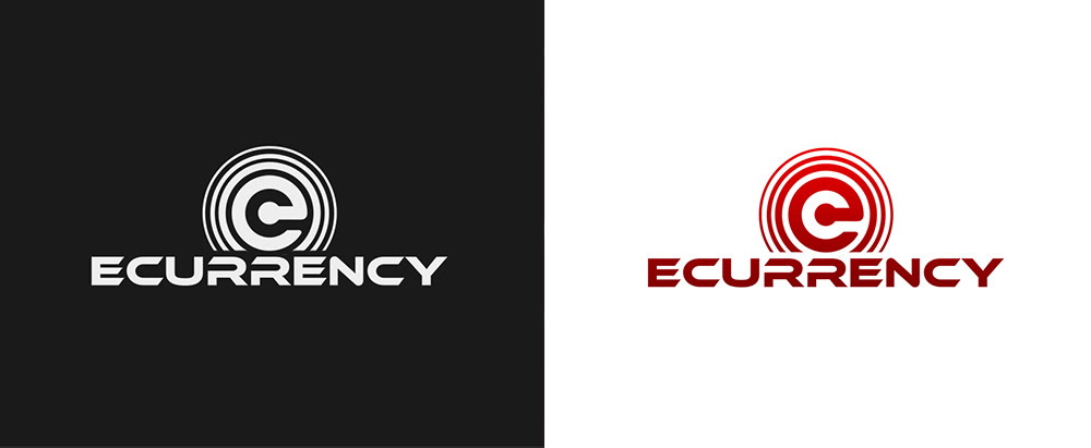
In 2016 before the campaign Firstly I started with rough sketching and brainstorming for the main currency symbol representing ECurrency. At this stage I drafted the "eC" when I came up with the idea to combine the "C" inside the "e". The design was accepted by the client.
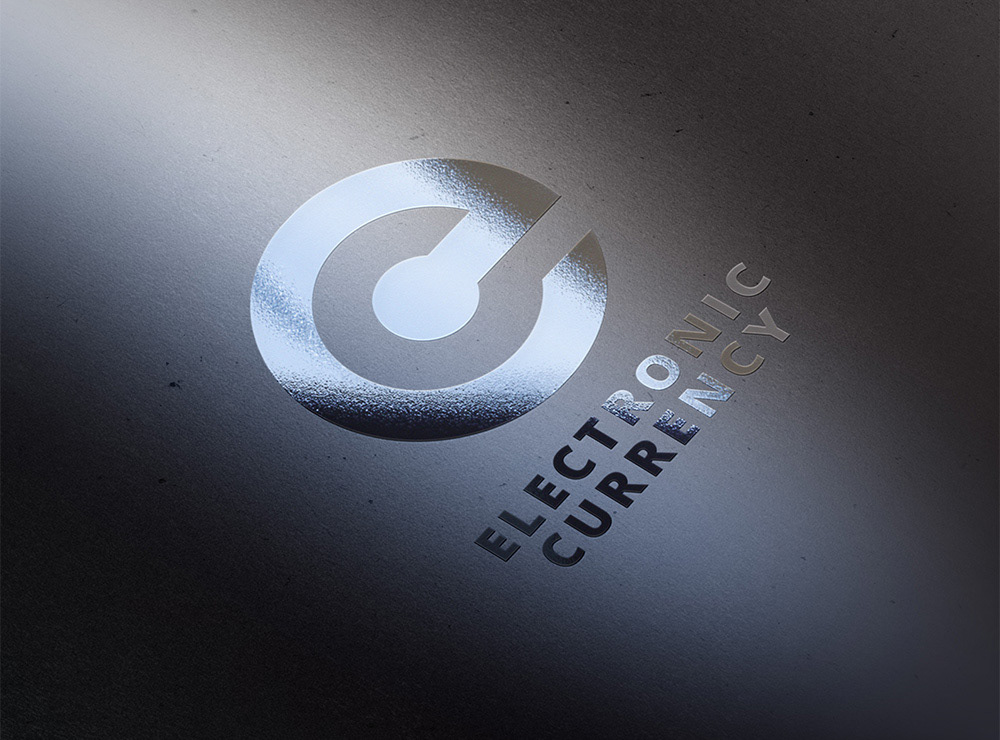
For the purpose of connecting the currency symbol into a solid logo of the project I modified the logo to a version with circles that stand for a pulse and rising sun and added the name. You can see the final ECurrency logo version on the landing page picture below.
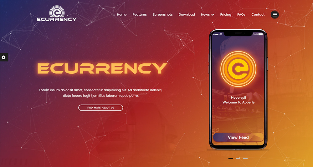
Landing page prototype with the new logo
"Rising pulsing Sun" of Ecurrency - final version of the logo.
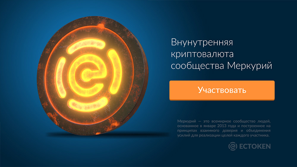
ECToken
The Ecurrency campaign started with emission of its own Tokens. ECTokens had to share the same symbol as ECurrency but differ visually. The visual keys were: fuel, flame, power reserved inside. At first I made the Token sign, which is the main "eC" sign surrounded by the round brackets referring to the unreleased power of Tokens. Further I created a 3d visualization for the Token, using its new logo for the campaign purpose. Watch the 3d visualization below.