CORPORATE DESIGN
I had a great luck to develop a corporate identity for a entire resort and restaurant company in Greece launched in 2015. During the following years I was working on various restaurant projects that belong to Rest Group and were ran by it. I developed brand identities for a solid number of restaurants and locals during two second years, even though many of them have never been launched. This page presents my work on the Rest Group brand and several restaurant projects.

Current final logotype

In the presentation below I explain how the brand was born and what were the initial ideas and thoughts and where did they came from. These slides come from the original pitch:

Very first rough version of the RG logotype.

/ Rest - abbr. of restaurant / Rest - recreation, relaxation, rest  

Rest Group  mainly running restaurants and the "Rest" which also stands for Restaurant creates a proper association. Since the company is going to do hotel business too, the meaning of Rest as recreation fits perfectly.

The initial thought was to use a uniform shape of the RG logo for all new restaurants to associate them with the main company.

It didn't get accepted in favor of a unique design for every new project but with placing the original RG logo on new logos.
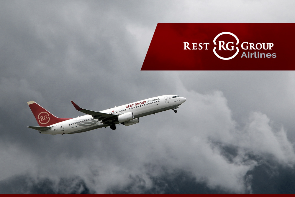
Here you can see all slides from the original pitch presentation made in 2015.
Rest Group has many great plans and the brand is ready for the future.
RESTAURANTS

Tigani
Tigani is a hand made restaurant on a greek marina ran by restaurateur Nataliya Pikshikova within Rest Group in 2016. Although Tigani didn't remain for a long time, it was very well received for its cuisine and design.

"Tigani" in Greek means a frying pan.
Fernando
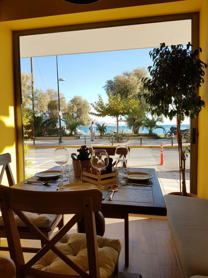
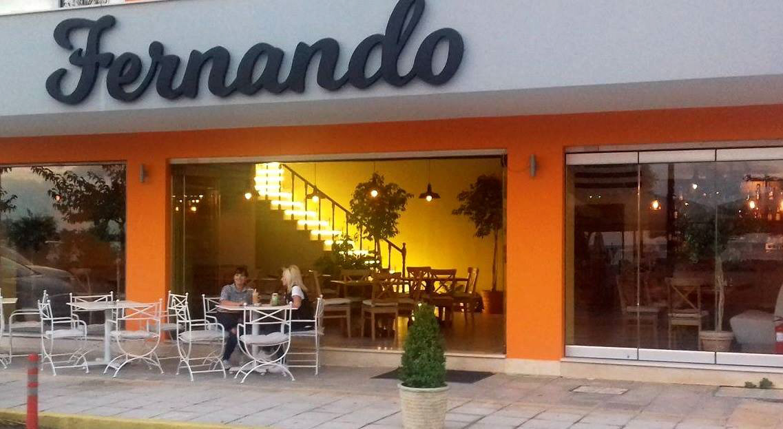
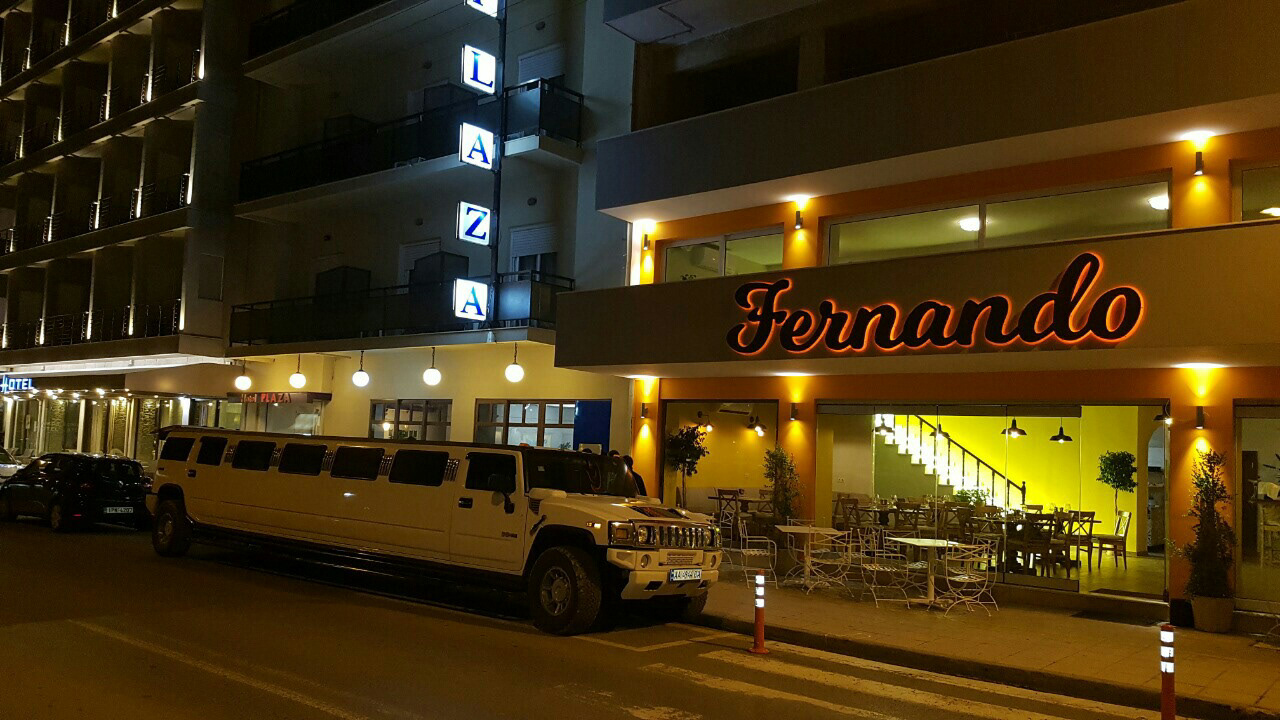
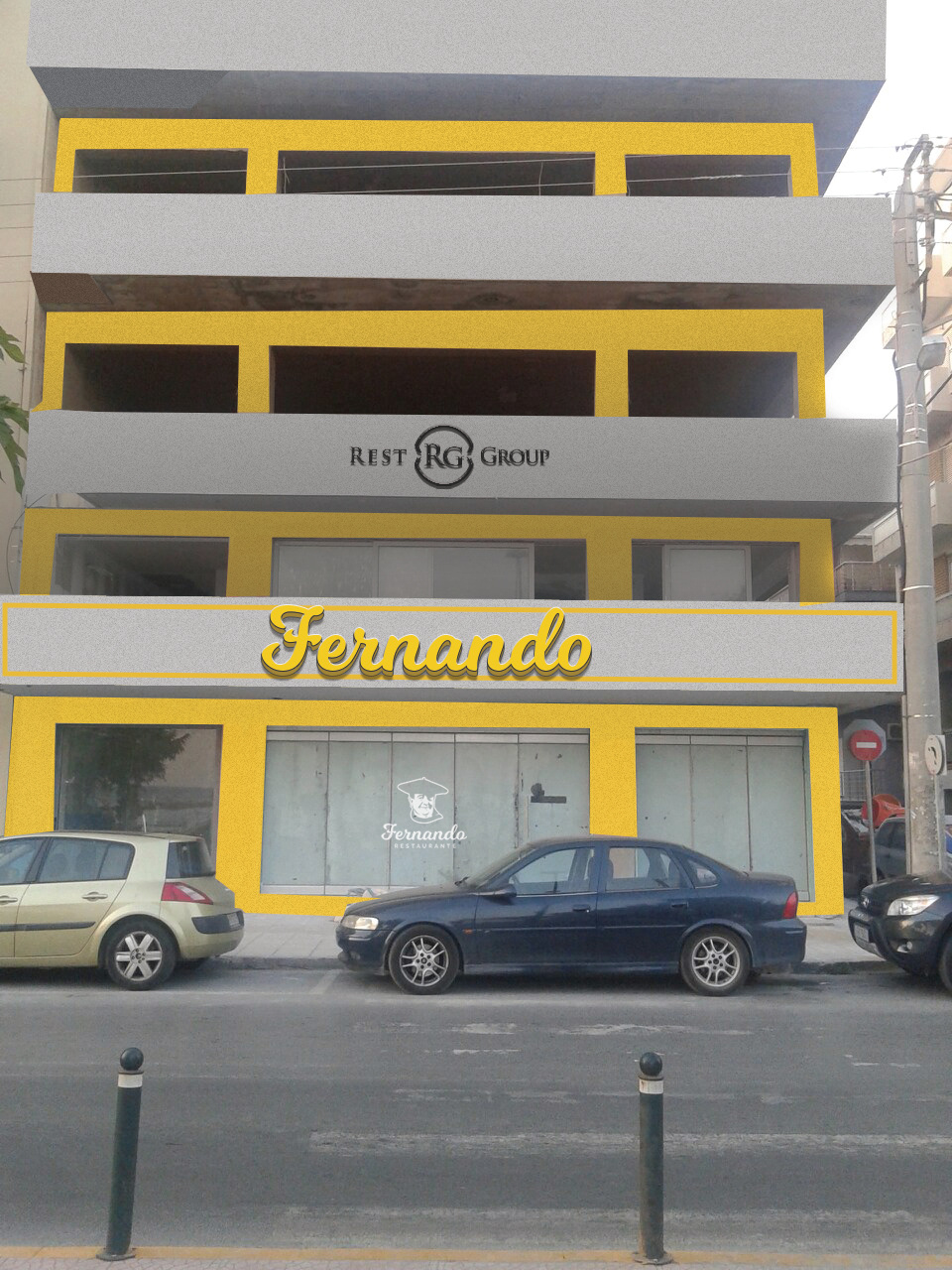
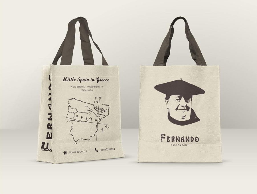
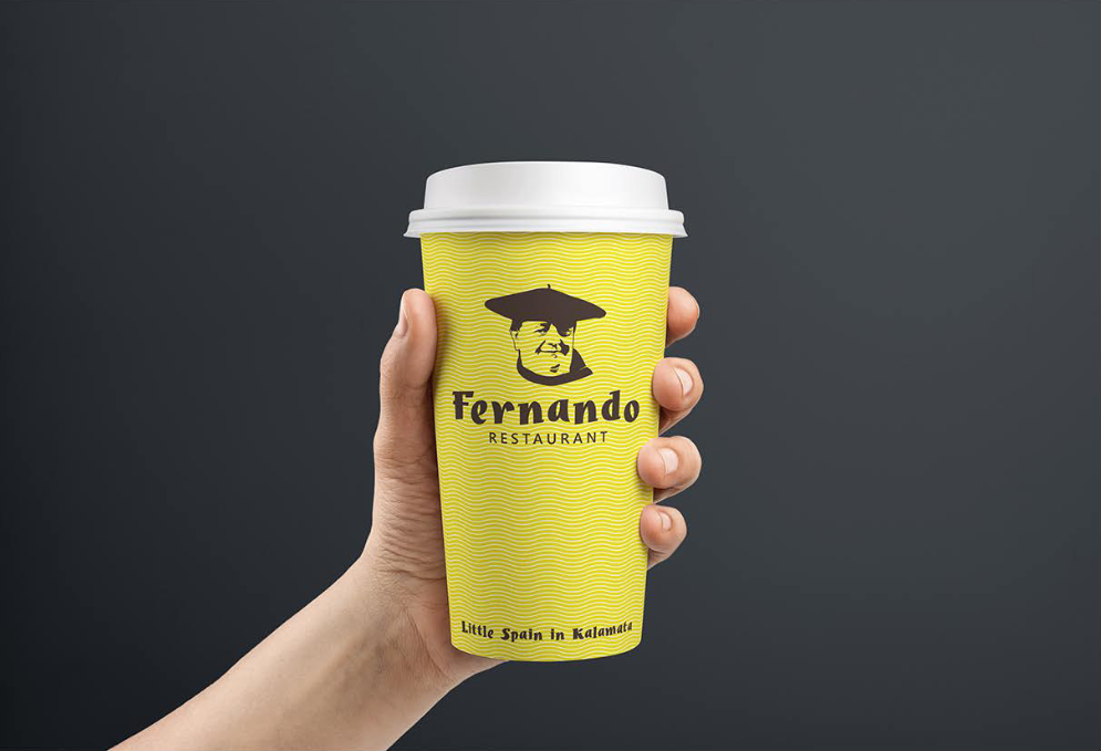
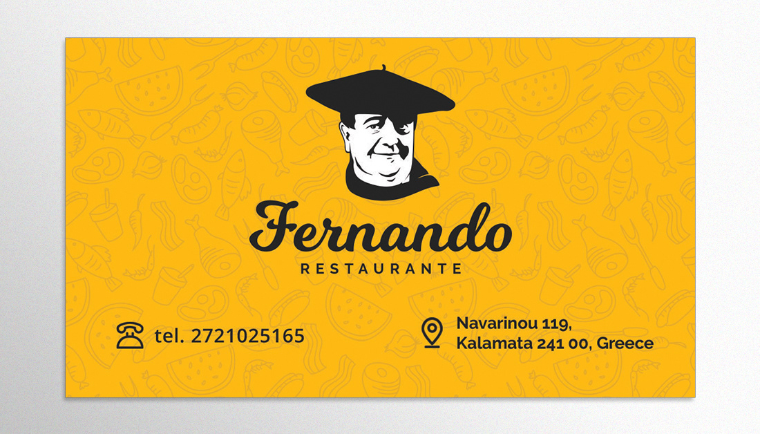
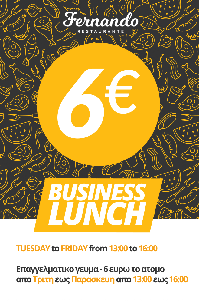
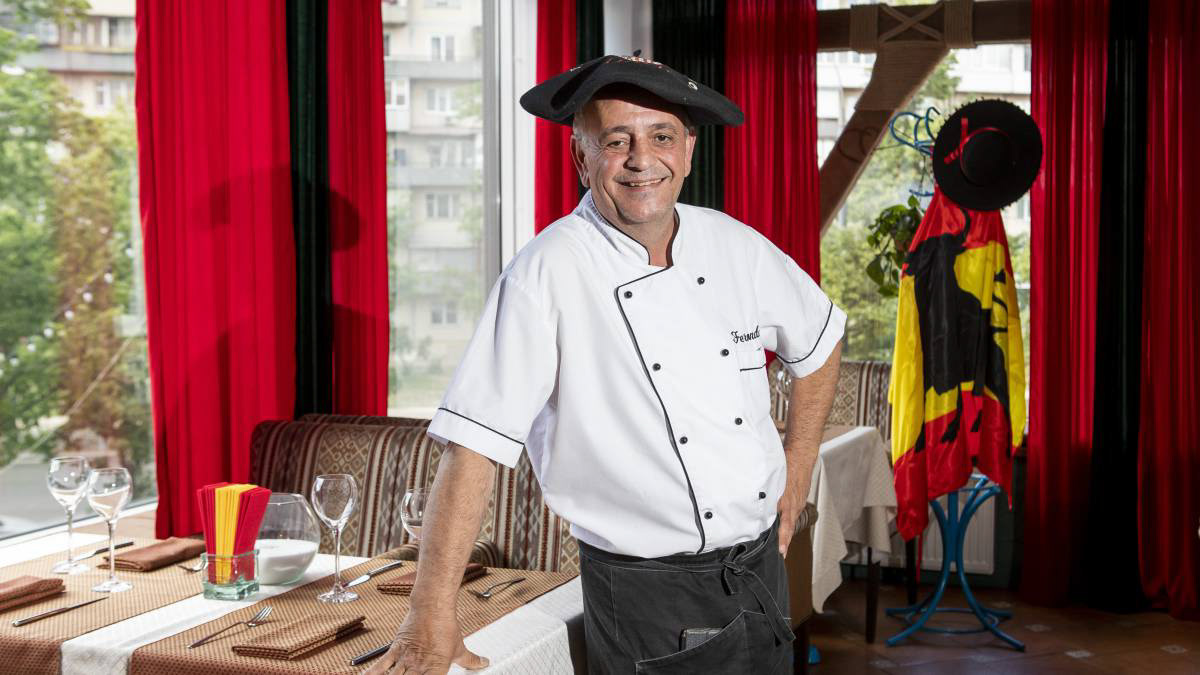
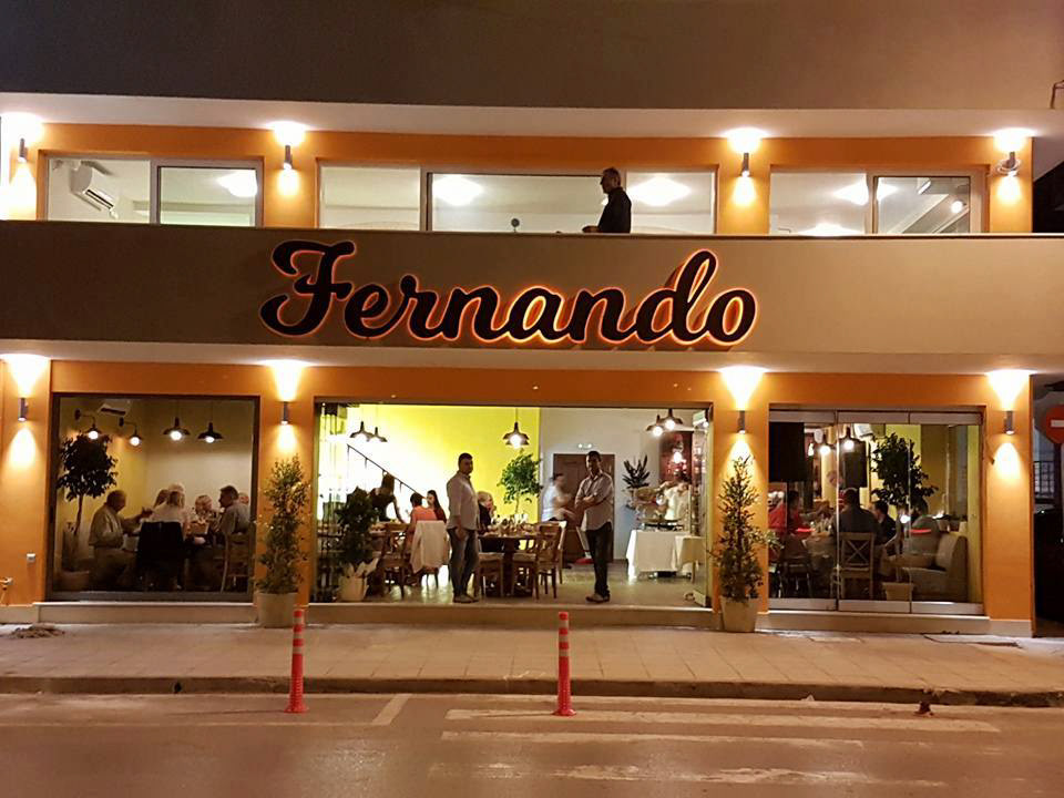
Fernando Restaurante has been initially a Spanisch local but its cuisine and style has changed over the time that it became a classical Greek taverna located near to the beach. The logo survived the changes although it loses the face of the character Fernando on its logo.
Atmosphere
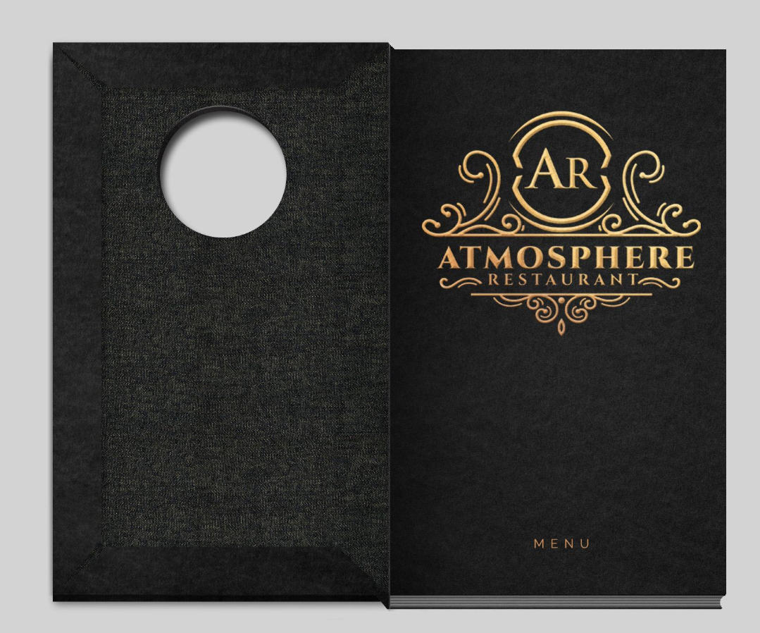
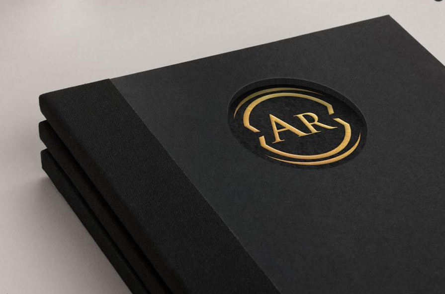
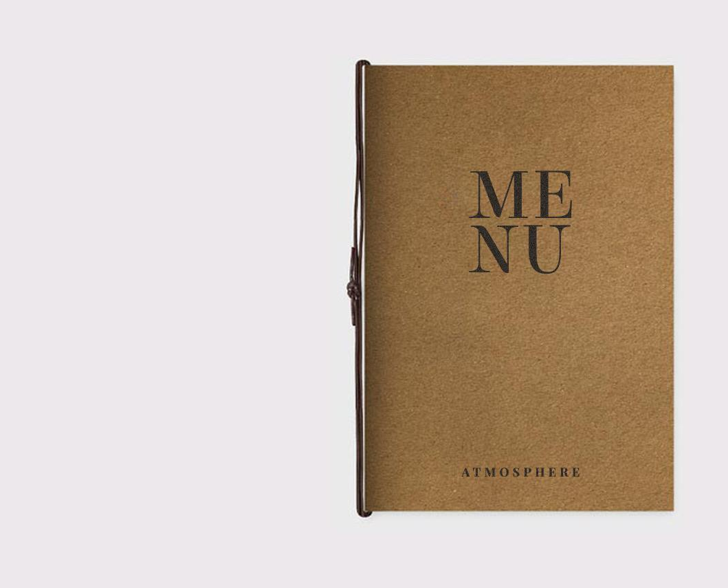
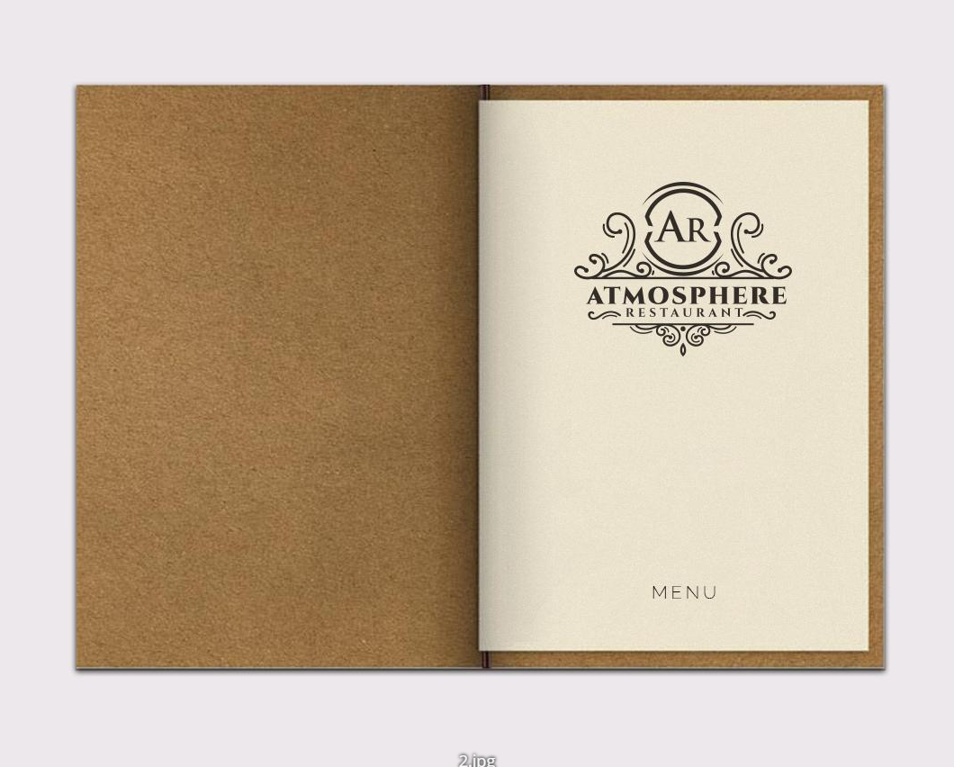
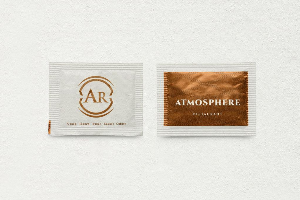
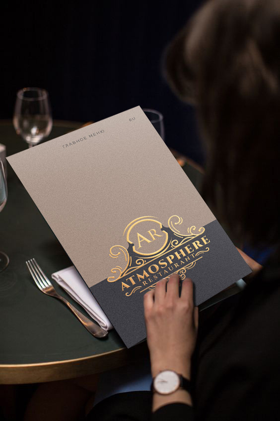
Atmosphere is another project of Rest Group, where a luxury-styled restaurant-club was opened. This project was especially intensive, as we found it hard to agree upon a logo design and because the restaurants style has change during the process. Plenty of logo concepts were created before client was satisfied and chose one. A few logos were made are presented below as well as the final accepted design.

Seahorse logo conception

Final accepted logo design.
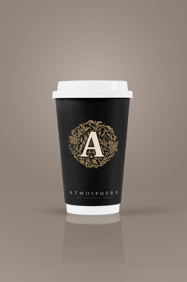
Here you can find more logotypes created during that project for Atmosphere as well as interior visualizations.
Park-Restaurant
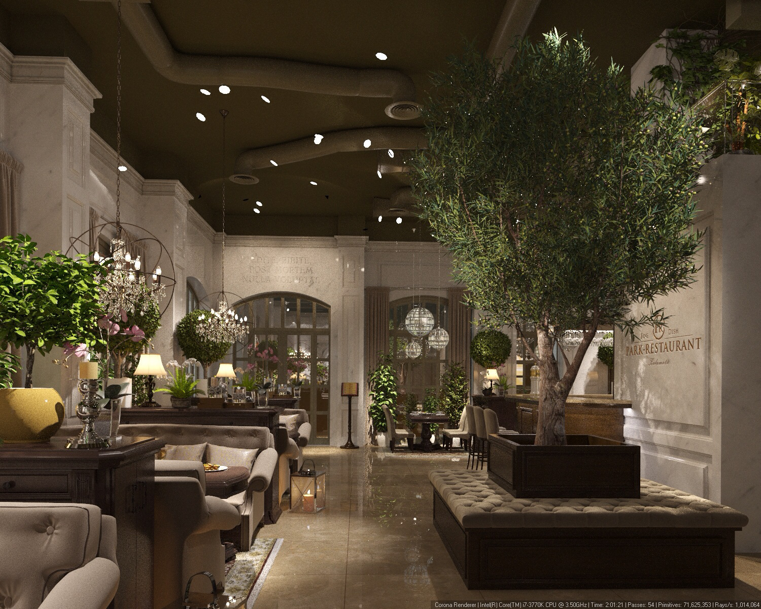
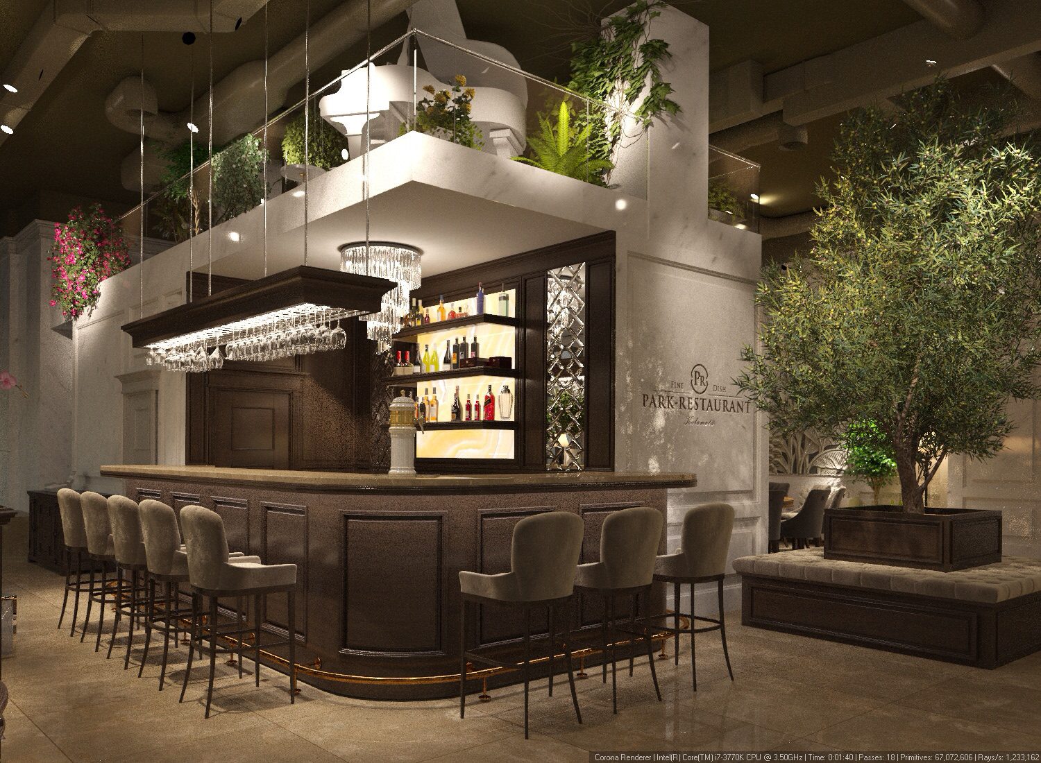
Another conception of a luxury restaurant placed inside a park near to the beach. To the moment when the project got canceled many materials, visualizations plans and the logo design have been already done. You can see the result of this work below.
Interior visualization of Park-Restaurant made by Trudesign:
KOI
KOI was a conception of a Japan restaurant in Greece. The restaurant construction got canceled but all design has been completed and accepted. Koi (Japanese: 鯉) are colored fishes with red stain on white bodies. Koi is very meaningful for the Japanese, as the red dote on Koi's head is refereed to the national flag and the word sound similar to words "love" and "affection". This are strong associations and I was trying to connect them with the logo design.
Touristiko Taugetou
Touristiko Taugetou is a restaurant placed in Greek mountains, that belongs to Rest Group. You can see how the restaurant was branded in details on a separate site here.
Back to Top